What I love the most about freelancing is the freedom to make good money when working on clients’ projects while having time to travel and work on my own projects – be it start up ideas, products, training courses, or books. I mentioned that in my previous post about freelance success.
Today I am happy to report that my first book is going to be available on Amazon in the beginning of May (subscribe to my list to get updated) but I need your help!
Asking for help to pick a book cover
The book is called:
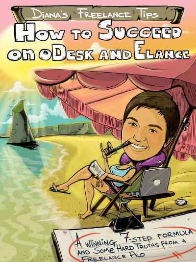
Diana’s Freelance Tips – How to Succeed on oDesk and Elance
A Winning 7-Step Formula & Some Hard Truths from a Freelance Pro
Currently I have two professionally designed book covers which I like. The message I want the book cover to convey is two-fold:
1) to instantly make it clear it is a how-to book and is the only thing one would need to lay a solid foundation and kick-start their freelance practice on oDesk and Elance.
2) to communicate that freelance is not just work or a place, but a lifestyle; that as a freelancer, you are in control of your life, a master of your time, and you have the liberty to choose what you do and how you live your life.
I think both covers convey the desired message about the book content but are quite different. So I need your help.
Which of these two book covers do you like best?
Click the images to view larger versions (they open in a new window).
 |
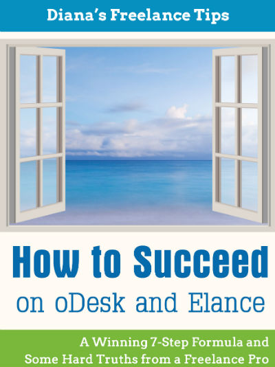 |
| #1 – with the illustration | #2 – with the window |
Please, vote in the poll below and tell me in the comments why you prefer one or the other, or don’t like either of them.
Your help is much appreciated!
~Diana
P.S. If you want to get an update when the book is available on Amazon, join my community.

Diana, did Little Zotz Lauren’s S.O design that illustration on the left handed side? The design elements look vaguely familiar!
I like both of them, but will pick one.
Elna
Hi, Elna – no, a local freelancer designed the #1 cover with the illustration. I don’t know why it looks familiar – that’s me in the cover, and it’s my first caricature – ha-ha 🙂
Thanks for your vote!
~Diana
Hello Diana Marinova,
Well I really liked the first cover picture (with illustration) and I guess it will attract the readers. And this is just my opinion though.
Thanks
Thanks for your vote and feedback, Gordan!
~Diana
It’s hard to pick. The image on the first cover is really cool, but the title font is a bit casual. The second one is more in-line with genre expectations.
I agree with Jeri’s comment. The window design gives me more of a “take me seriously” impression. Good luck with your book!
Thank you, Jeri and Julia, for your comments, votes and feedback why you prefer the second cover. Duly noted and much appreciated!
~Diana
The design on the left is a bit comic bookish and is cluttered with too many visual elements. The second one, on the right, is, well, just right. It evokes the freedom of a freelancer’s life. Besides, do you really need a cartoon-like portrait of yourself on the cover? I think not.
Xerxes Aga.
Thanks for your feedback, Xerxeska – duly noted and much appreciated. I saw your comment on LI, too so double thanks 😉
~Diana
Hello Diana,
I agree with the previous comment that picture with opened window evokes the freedom of a freelancer’s life. When I see it it makes me feel like I can fly and reach all the most ambitious goals. I think the window picture is the best fit. The first image is also great, it is bright and positive. However, as for me, it looks a bit too relaxing.
Good luck with the book! 🙂
Ana
Hi, Ana – thank you so much for your detailed feedback and confirming previous comments. Duly noted and much appreciated! What you described as received message and feeling from the second cover with the window is exactly the intended message.
Thanks again,
~Diana
Hi,
I voted for neither, sorry, but you did ask! 🙂
A two-second-glance impression is what counts when you are competing with other books and mine follow:
#1: comic novel, child-like, not a professional, are you were smoking a pipe?!
#2: Stock images – those open windows have been over used, even by me, and make me wonder how much experience you have; while the message itself makes me think about how not to work – perhaps a desk or a laptop in front of the open window would give a more complete message.
Good luck with the book though,
all the best
Eleanor
hahaha, Eleanor, you made my day – smoking a pipe? No, munching on a pen LOL
Thanks for the great and detailed feedback. I believe it is all a matter of preference illustration vs a more traditional image…
But I’d like to ask a follow up question – what does the cover have to do with how much experience I have? I mean, I have zero experience with book cover design… How a stock image (as you call it) would tell the reader anything about my experience and the substance of the book? Don’t you think the reader will read the sample IF the cover caught his eye?
I am genuinely asking because among the 50+ comments I got through various channels from potential readers, you are the first to say that either cover will cause the reader to question my expertise on the subject matter and I want to learn more about your thought process, and how that could be.
Thanks in advance, if you choose to elaborate 🙂
~Diana
I’m going to go with #2. #1 looks like either a joke book or a how-to-draw book, and I can’t tell what that is in your mouth, but it isn’t attractive to me, either way.
#2 looks way more professional and will align nicely with readers’ expectations.
Good luck with the book!
Thanks for your vote, Jennifer, and for sharing the reasons to choose #2. Much appreciated and duly noted!
~Diana
My choice is #1. I like the metaphore of window/s but it has become too common nowadays. The cover with the illustration appeals to me because it is fresh, it is colourul and full of life, it gives some idea of how you look like (I decided it was you in the cover), it implies freelancing is fun and can be done from anywhere in the world, any setting or time. It makes me want to read the book to find out how I can be in full control of my lifestyle.
Good luck with the book!
Nicely put, thanks for your feedback and vote, Kremena!
~Diana
Diana, I wanted to make sure that I am not influenced by other people’s opinons before I make my choice. That is why It was only after I had written about my choice that I read the comments. Now I see that most of the previous comments are in favour of the second one (the one with the open window), which made me think that it depends on what readership you are targetting. Certainly, a global readership would be the ultimate aim but people’s perceptions vary from culture to culture. In our culture, with people being stuck in and fed up with boring jobs, the first one might work fine, especially with the younger generations. In other cultures it might imply too frivolous an attitude, especially if the prospective readers are over 35-40.
I hope this is of help.
Thanks for your follow-up comment, Kremena – you are absolutely right! A lot of what you said is being taken into account – age bracket, culture difference, even profession seems to have clear impact – all of this I will describe in y follow up post when announcing the chosen cover.
And by the way, don’t let the comments mislead you. The majority of people who vote in the poll do not leave a comment here, on the blog, explaining their reasons… some do so in various discussions on LI but still – #1 cover with the illustration is actually the leader in the vote for now.
We’ll see – it’s a tight poll, I didn’t expect it 😀 When I launched the poll, I had clear idea which one people would prefer but I was wrong… an interesting follow-up post is shaping up already with all the great feedback I receive.
Thanks again for your vote and comments.
~Diana
I voted #1 – but it needs new fonts all over. Complete font overhaul and a bit of tweaking for the visual accents, and it’ll get the point across. The illustration is great, fresh, and it’ll set you apart from the crowd. It’s not obvious that it’s a how-to book (with the current font) but it has its own style and it’s an attention grabber, so even if I don’t recognise the genre at first glance, I’d stop to see what it’s about.
#2 is every help book ever [EVER] published. It’s generic, it doesn’t stand apart, it can be a how-to about pretty much everything. If it’s placed next to similar books, reader’s eyes will glide right over it
Good luck 🙂
Thanks for walking me through your thought process, Bojana – I see what you mean and I completely agree. Thanks for the vote!
~Diana
Diana — I voted for neither. My concern is that you are assuming people will know what oDesk and Elance are. Writers just starting out may not. Also, the title would be more descriptive and keyword friendly with the title: “Diana’s Freelance Writing Tips.” Just my opinion and hope this is helpful.
Thanks for the feedback, Jeannette – but there must be some kind of confusion.
I am not giving freelance writing tips so the suggested title is not relevant. As for assuming people know what oDesk and Elance are – well, the potential readers of the book do know. It’s not a book for everyone, it’s a book for people who want to succeed n oDesk and Elance. The title is exactly what it has to be, provided the content of the book 🙂
A follow up question if I may – you say you voted for neither but then you gave feedback about the title of the book, not about either of the covers. Provided the title of the book is just right as is, will you still vote for neither cover? Why?
thanks in advance, if you choose to elaborate.
~Diana
I like #2 as well. I agree with Jeri in that it is more in line with genre expectations. #1 is a cute caricature of you, but I would tend to not take it too seriously…and I know that you are completely serious about your work and this book:) Can’t wait to read it!
Thanks for the vote and feedback, Jacquie – and you are right, I am totally serious about my work and book, but having fun is a big part in all of it LOL. Feedback duly noted though 😉
~Diana
Hi Diana,
I gave a deep look, thought and analysis to both the cover pages, none of them are bad, but not as per my preferential choice. Personally, whenever I look at a graphic design, I tend to incorporate the leading idea into the design. Preferably, I would love a design which depicts a freelancer, an emblem in way which clearly denotes the preparation to be done by a freelancer to succeed.
Let me try to visualize the design crawling in my mind by using some words. A human (or even group of humans) breaking the barriers of the traditional work environment, getting equipped with the right tools to succeed during their freelance journey. Something like getting ready for a big war to break the barriers holding him back. Hope, it gives you some visuals about what I am thinking at the moment, although, merely my personal opinion.
My best wishes for a grand launch and big success. 🙂
Thanks
Ashutosh
Hi, Ashutosh – thanks for your feedback on the covers. I see what you mean about the cover design incorporating the key message. I played with the idea of tools and toolbox as well but nothing god came up, design-wise, I mean. These are the top 2 covers I liked. I wanted to have 3 to choose from but only 2 made it to the final stage that are worth my reades’ votes. 😀
I voted for # 2. An open window to opportunity. That’s my take.
Thanks for the vote and comment, Jonny! Duly noted 😀
~Diana
I like:
#2 – with the window
Diana, tell me, please, why chose Amazon? How many pages is the book and how long did it take you to write it?
Thanks for your feedback!
As for your questions – when I need a book, I usually go to Amazon and I believe many people do so, too. So it was only logical to publish my first book there and see how it goes.
How much time did it take to write it? Plenty. Well, I wrote the first draft in only 10-15 hours. But the then the reviewing, editing and tweaking began. Then the critique from a professional editor and another round of editing and tweaking, and so on.
I will probably write a bog post (or a series of them) on the topic after the book is published – to give a glimpse into what went into the whole process, including time.
Hope this helps and answers your questions.
~Diana
Hi Diana,
Both covers serve the purpose, but for the second one looks more professional and would let one think themselves and not as focused. Anyways….thats just two cents from my side. Wellll…good luck with its launch. Look forward to it.
Regards.
-Sultan.
Thanks fir the feedback, Sultan! Although I didn’t comment earlier, your feedback was appreciated and duly noted well before I chose the final cover.
~Diana